UX teardown
A written review of your current site's decision path, friction points and drop-off, with prioritised recommendations — yours whether or not we work together.
A beautiful site that does not convert is an expensive brochure. I design interfaces the way a performance marketer thinks — every screen has a job, every element earns its place, and success is measured by how many visitors finish the task rather than by how the mockup looks in a portfolio.

Every project starts with a defined primary action and a baseline, so the redesign can be judged against something other than taste.
Most 'redesigns' are a repaint. This is a rebuild of the decision path a visitor takes.
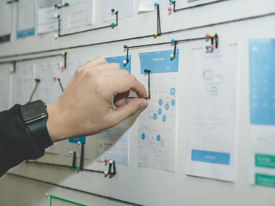
Before anything visual, the job is to work out what the visitor needs to believe in order to act. That comes from your sales calls, your objections, your analytics and — where possible — session recordings and heatmaps showing where people actually stall.
The output is a decision path: the exact order in which claims, proof and reassurance need to appear so that by the time someone reaches the form, the obvious next step is to fill it in.

Wireframes settle hierarchy and copy before colour enters the conversation, which is where most design rounds get stuck arguing about the wrong thing. Once the structure holds, the visual layer is built on a proper system: type scale, spacing rhythm, colour tokens and reusable components.
That system is what keeps a site coherent as it grows, and it is why adding a new page six months later takes an afternoon rather than a fresh design project.

A design that only exists in Figma has not solved anything yet. Pages are built as clean, fast, responsive HTML and CSS with animation used to guide attention rather than to show off, and with Core Web Vitals treated as a design constraint from the first screen.
After launch the work continues: analytics and event tracking are wired in so you can see where people still drop, and the pages that carry the most traffic are tested and refined rather than left to age.
Files you own, code you can host anywhere.
A written review of your current site's decision path, friction points and drop-off, with prioritised recommendations — yours whether or not we work together.
Structure agreed before visuals, plus a clickable prototype so the flow can be tested before a line of code is written.
Type scale, spacing, colour tokens and a component library your future designers or developers can pick up and extend.
Hand-coded responsive HTML and CSS, optimised images and purposeful animation — delivered as files you host wherever you like.
Designed on the small screen first, with semantic markup, keyboard support and contrast ratios that pass.
Event tracking, scroll and form analytics, then structured iteration on the pages carrying the most traffic.
Current analytics, heatmaps and conversion rate reviewed, friction documented and the primary action defined. We write down the number we are trying to move before starting.
Information architecture, user flow and low-fidelity wireframes with real copy. Approving hierarchy and message at this stage prevents expensive rework later.
Type, colour, spacing and components built as a system rather than page by page, then applied across screens with an interactive prototype for review.
Hand-coded responsive front-end with Core Web Vitals budgeted, purposeful motion, semantic markup and analytics wired in before launch.
Post-launch tracking on scroll depth, form starts and completions, followed by structured improvements to the highest-traffic pages.
Where the money goes when a site is built three different ways.
| Theme or page builder | Visual-only designer | Conversion-focused UI/UX | |
|---|---|---|---|
| Starting point | A template picked for how it looks | A moodboard | Your analytics, objections and the action you need visitors to take |
| Page speed | Heavy plugin and script payload | Rarely the designer's concern | Core Web Vitals budgeted before design begins |
| Mobile experience | Whatever the theme does by default | Desktop designed first, mobile squeezed after | Designed mobile-first, because that is where most of your traffic is |
| Copy | Lorem ipsum replaced with your words | Supplied by you, unchallenged | Written against the objections your sales team hears |
| Consistency at scale | Breaks as pages are added | Every new page is a fresh design | Component library keeps page thirty consistent with page one |
| Handover | Locked into the builder's ecosystem | A folder of images or a Figma link | Figma system plus clean production code you own and can host anywhere |
| How success is judged | It went live | Everyone liked it | Conversion rate against the baseline recorded at the start |
Scoped by page count and complexity after the free teardown. Landing pages are also included inside performance marketing retainers.
A single high-converting page for a campaign
A full multi-page site designed and built end to end
Continuous testing on pages that already carry traffic
You receive the editable Figma file and the full source code. Nothing is locked to a proprietary builder, and any developer can pick the project up after handover.
Audentia Research — a 19-page executive search website designed and built from scratch.

The brief was credibility — an executive search firm is asking clients to trust it with senior hires, so the site had to feel considered on every page. We locked a design system early, normalised the header and footer across all nineteen pages, and wired the contact flow into a proper email pipeline so enquiries reached the sales team immediately. Consistency did more for the perception of quality than any single clever screen would have.
The principles behind pages that convert, without the jargon.
The fastest way to lower a conversion rate is to give a page five equally weighted options. Choice creates hesitation, and hesitation loses the visitor. Decide the single action that matters most — book a call, request an audit, send a WhatsApp message — and let the entire page lead there. Secondary links are allowed; secondary buttons competing for the same attention are not.
People do not read pages, they scan for answers to a fixed set of questions: is this for me, can you actually do it, what will it cost me, why should I believe you, and what happens if I click. A page converts when those answers appear in the order the visitor needs them, which is why wireframing the argument comes before choosing a colour.
For most Indian businesses the large majority of traffic arrives on a mid-range Android phone over a variable connection. Designing on a 27-inch monitor and shrinking afterwards produces sites that technically fit the screen and functionally do not work. Design the small screen first and the desktop version tends to look after itself.
Motion is useful when it shows relationships — this panel came from that button, this section is now active, this field has an error. It becomes a liability when it delays content, fires on every scroll, or ignores a visitor's reduced-motion preference. Every page I build respects prefers-reduced-motion and keeps entrance animation short enough not to hold up reading.
When the same person designs the landing page and runs the campaign, the promise in the ad and the headline on the page cannot drift apart — and that message match is one of the strongest levers on both conversion rate and Google Quality Score. It also means a page can be adjusted the same week the data suggests it, instead of waiting on a separate agency.
UX is the decision path — what the visitor needs, in what order, and how they move toward the action. UI is the visual layer: type, colour, spacing, components and states. A beautiful UI on a broken UX converts badly, and a sound UX presented poorly loses trust, so both are handled together.
Both. You receive the editable Figma file and a hand-coded responsive front-end you can host anywhere. I do not hand over a folder of images and leave the build as your problem, and I do not lock the project into a proprietary page builder.
A single landing page typically runs one to two weeks from teardown to launch. A full multi-page site is usually four to six weeks depending on page count, content readiness and how quickly review rounds come back. Content is normally the slowest variable.
Yes, and it starts with a teardown rather than a blank canvas — reviewing analytics, heatmaps and current conversion rate so we know which pages are worth keeping, which need restructuring and what the baseline is that the redesign has to beat.
Yes. Pages are built with semantic HTML, a sensible heading hierarchy, descriptive alt text, fast load times and schema markup where relevant. Design and technical SEO are the same job done at the same time, not a clean-up afterwards.
By the conversion rate on the primary action, against the baseline recorded before we started. Event tracking, scroll depth and form analytics are wired in at launch so the answer comes from data rather than from opinion.
Ready to scale your growth? Drop me a message or reach out directly.